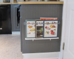
Now that we’re finally done I’m excited to share the details, but here’s where we started . . .
.png)
The picture to the far left is the wall that came out (woo hoo!) and became my double-depth counter-top. The cabinets here were re-configured to work around the new design and the uppers were painted the same white semi-gloss as the trim while the lowers were painted a charcoal gray. If I had know the opening would let in so much light I would have gone even darker on the lower cabinets.
.png)
The picture on the far is where we pulled out upper and lower cabinets to build the new pantry and the opening for the fridge. We re-used the cabinet above and painted it the pale gray to match the surrounding walls to help give the fridge a more built-in look. FYI- if you’re thinking of creating a built in area for your fridge: We put a vent at the top of the wall and vented it into the pantry to help the refrigerator vent properly.
.png)
We pulled out the tile floor and replaced it with a vinyl floor. (SO much easier to clean!!) My new pantry is super small but the most wonderful little storage area. And, it hides the microwave! Did I forget to mention, what an amazing difference the ceiling trim makes?
Stay tuned . . . more details coming next week!
Today’s details:
Painted Blue Chest (I bought this chest unfinished and tricked it out myself!) Vinyl flooring Back splash and decorative inset (similar) with border (similar) detail tiles


Jennifer (White Tulip Designs)
Hi Janet, That’s what mine are. (One reason I hated them before.) But, the doors are wooden. That’s why I used the Kilz to so of seal them as well as prime them before painting. Since, sanding was out of the question.
If you have any other questions, please don’t hesitate to ask! Thanks!
NO I still do not think people get what I am trying to convey.
The whole cupboards are made of the chipped pressed wood with a paper like cover over that. it is not wood .