Ok, I know this is a little different but hear me out. A while back it was pointed out to me that I had maybe overdone it a bit in my mission to de-bachelorize (totally a word, I’m sure of it). In his defense, my dear Hubby has never complained a bit.
So, I thought I would try to inject a bit of geek-chic, if you will, back into our home. To start with, Hubby is a huge Lord of the Rings fan and that’s where I started. There’s got to be a way to be design friendly about it, right?
The idea started out as a joke and then I thought it would be something he might get a kick out of. As a friend pointed out you could do this so many different ways (think the Cantina Scene from Star Wars). The sign is something I put together from my Hubby’s favorite bits in the movie. And, the original layout was to have another line but when I was adding in the wording I felt like it would be too crowded. So, this is what I ended up with and I’m really happy with it.
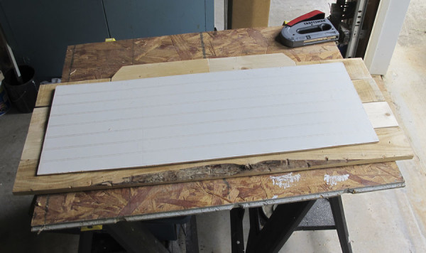
I started by measuring where the sign would go and designing a layout to fit. Then I cut and sanded pieces of both new wood and pallet wood to size, fitting them together like a puzzle. The top pieces were cut at an angle using a miter saw. (see similar here or use a miter box like this) Here I used a piece of left over bead-board as a backer to attach them and hold them together.
.jpg)
.jpg)
When I was happy with the shape and everything was nicely sanded I used a mixture of 2 parts black paint, 1 part water and 1 part glaze to “stain” the wood a darker grey/black. It gave the wood a look like it had been aged “wet” but out of the elements.

I let this dry overnight and then started the crackle process. Instead of using a regular crackle medium I used regular school glue and a coarse brush to brush it on.

You can see that I applied it more thickly in some areas to make it “crack” differently. Then, I let the glue dry for about 5 minutes. While it was still tacky I brushed on white acrylic paint really thickly.


Once it had crackled and dried thoroughly I decided the background was too dark. So I thinned out the white with some glaze and brushed over the whole piece. Much better!

I let this dry overnight before adding in the lettering. The glaze made it tough to add the letters using more popular Pinterest methods so I used my handy-dandy Artograph Tracer Projector. I don’t use it very often but love this thing! They make much snazzier versions but this little fella works just fine for me. I traced the letters with a pencil and then painted in the letters using the black “stain” that I had left over from before.

If you try your hand at your own “geek chic”, design friendly, creation I’d love to see!

* This post contains affiliate links but all opinions are my own.
Linking up at Met Monday, The Scoop, Remodelaholic , and Wow Us Wednesday








Jennifer (White Tulip Designs)
[…] Rustic Geek-Chic Sign {White Tulip Designs} […]
[…] DIY Rustic Sign courtesy of White Tulip Designs […]
[…] Co-Hosts Picks From Last Week Sunny Side Ups ||Chocolate Zucchini No Bake CookiesWhite Tulip Designs || Dining-Room-SignMy Life In Progress || Americas Independence Day Working Mom Magic || New Blogger Advice Repurposed […]
[…] Dining Room Sign […]
[…] Rustic Geek- Chic Sign from Jennifer @ White Tulip Designs […]
Thank you Cindy! I’ll post the info on my social media channels.
Hi Cindy, I’m so glad you stopped by! I don’t have a tutorial for creating the wording as of now. I’ll get something put together and posted. Thank you for suggesting it!
[…] shabby style sign from White Tulip Designs is great for adding your own style: paint any design you want, or go “geek chic” like she […]
I just posted a comment. I would like to let anyone who is looking at this know that on the website for DickBlick art supplies that they have the Artograph Tracer Junior Art Projector for $27.99. The extremely nice lady on the phone said that her info shows that the vendor is discontinuing this item, so it is on clearance. They have about 50 left, I almost ordered 2, lol. Hope this helps someone :]
Hi there, just discovered you today. Love your Bucklebury sign!! Unless I am missing it, I don’t see directions on how you designed the actual words. I see the link to the projector, which I plan to order, but I don’t see the info where you actually designed the words.
If you could provide info on this, I would enjoy the instruction. Thanks!!!!
Thank you!! I’m so glad y’all liked it! I’ll be linking up today for sure.
Hey, Jennifer! Just wanted to let you know that we loved your Rustic Geek-Chic Sign so much when you shared it at the #HomeMattersParty last week, we’ve HIGHLIGHTED it THIS WEEK! Hope you can check it out when you get a sec! Happy Friday!!! http://theroadtodomestication.com/2015/08/13/home-matters-linky-party-50/
[…] Rustic Geek- Chic Sign from Jennifer @ White Tulip Designs […]
[…] Rustic Geek- Chic Sign from Jennifer @ White Tulip Designs […]
Thank you Michelle! I’m so glad I did it. Honestly, it came out better than I thought it would! (I have a friend who suggested a “Star Wars Cantina” theme.)
See you later this week at the #HomeMattersParty !
This is so cool. I think my hubby and my boys could get into this kind of decor. They are all the geek, Lord of the Rings lovers. LOL!
Thanks so much for sharing at #HomeMattersParty I can’t wait to see what you link up next time! Thanks again.
[…] […]
[…] Co-Hosts Picks From Last Week Sunny Side Ups ||Chocolate Zucchini No Bake CookiesWhite Tulip Designs || Dining-Room-SignMy Life In Progress || Americas Independence Day Working Mom Magic || New Blogger […]
Thank you so much Christine! I’ll head over and link up!
You did an amazing job, Jennifer! It’s beautiful! Would love for you to share this at the #OhMyHeartsieGirlsWW link party! Hope you can join us! Enjoy your week!
Christine@CherishingaSweetLife
Thank you Joy!
Fantastic on both decor AND geek levels!! So clever- something for both of you! 🙂 Thank you for sharing with us at Treasure Box Tuesday!
Amy, thank you so much! I’ll be there for sure!
Your sign is gorgeous. I love how you used different pieces of wood and the crackle finish. I’ll be featuring it at Your Turn To Shine on Thursday :).
love your sign, very clever! will be getting one of those tracers.
Thank you Sarah!
LOVE this! very cute
Sarah @ EDEA
http://www.edea-smith.co.uk
Thank you Ladies!
This looks so amazing! Pinned and tweeted! Thanks for being a part of our party. I hope to see you, Monday at 7 pm. Lou Lou Girls
Thank you Lauren!
Gorgeous! The lettering turned out so cute and you styled it so well!
Thank you Becky!
I love that sign!
Thank you Kathy!
Wow i love the sign!!
Kathy
Thank you so much Nellie! That is the exact reaction I wanted! FYI - when I styled the shelf I, completely by accident, pulled together other elements from the books. (the bunny, the miniature travel cases, the china, the candle and the antique books all sort of fit) Thank you for stopping by!
Morning Jennifer,
Nice to meet you here in blogland, came over from StoneGable.
I absolutely love this whole wall vignette. It is fun, charming
adorable, and chic. I would not change a thing, it is perfect.
Just love love love the sign……..have no idea how it fits
with lord of the rings, but it is just so neat…………and
so nice you would do that for your hubby too.
Blessings, Nellie
Thank you Brenda!
Great project! Love the way it turned out 🙂
Thank you Betsy!!
Love this!!!