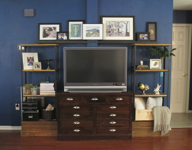
Once I had the shelves (on either side of the TV) finished I knew that styling them with frames on top might be an issue since we would still need to move the shelves from time to time. However, I really wanted the look of larger frames layered and leaning rather than hanging. You know, when you know what you want, you know what you want, right? Ikea has some pretty fantastic picture ledge that I’ve used in other spots and other projects (see dining room shelves) but they wouldn’t quite work here. So, I made some that were very similar but fit my dimensions a bit better.
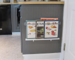
Part of my master plan for the TV wall included adding artwork and finding a way to camouflage that weird, column, thingy in the wall. And this is how I fixed it!
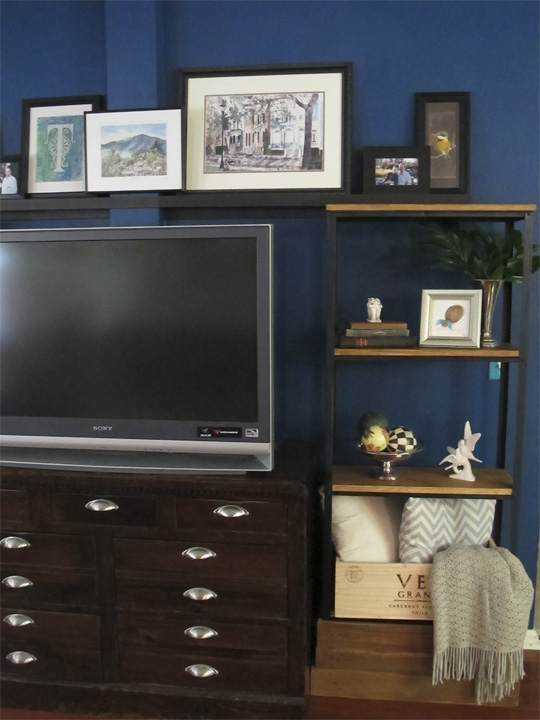
Once I measured the width that I wanted and cut the pieces to size I used a level to draw a guide line. Then I attached the support to the wall (using screws). Then I balanced the ledge piece along the top of the support and attached it to the wall using corner braces.
To finish it off I attached a thin piece all along the front to give a lip to the ledge and keep items from sliding off. It reaches from one set of shelves to the other.
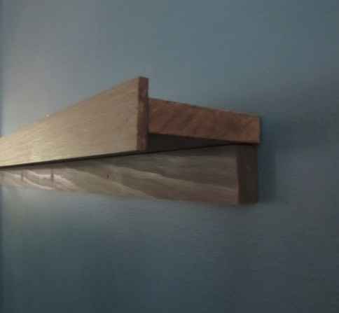
Here’s a side view of the ledge for you to see how it was put together. I used common board for the brace and the ledge piece and then a thin piece of wood (hobby board) attached to the front with brad nails. I used my black stain to color it all as well.
I hope this inspires you to find a fix for that decorating hurdle in your home. Have a great week!
Linking up at Met Monday





Jennifer (White Tulip Designs)
Thank you Mila! I was a little nervous when I started painting but on just one, I’m so happy with how it turned out! It’s Valspar - Deep Sea Dive (eggshell). I’ll head over and link up, thanks for the invite!
I love the look! My parents had similar problem with their tv corner. They’ve decided to mix
all furniture up at the end,but your idea would fit there as well!
I love wall color you chose.
Also, I would like to invite you to share your ideas with our party Idea Box:
http://milaslittlethings.com/2015/07/idea-box-thursday-link-party-18.html
xx
Mila
Thank you!
that looks great, i love the way you built it around that bump out.
b
Thank you Alayna!
What a unique eclectic looking “entertainment center” you have created! I love that you included the lip on the edge of the shelf so things don’t slide off.
Thanks for joining us at the #HomeMattersParty